A Healthy Snacking Brand Rooted in Tradition and Fun
Witnessing a newly liberalized India flood with unhealthy yet tasty processed snacks, two brothers saw a critical gap. Children and the elderly were consuming these products with zero nutritional value. Motivated to challenge this, they founded a new brand to prove that snacking could be both irresistibly delicious and genuinely healthy, merging taste with nutrition.
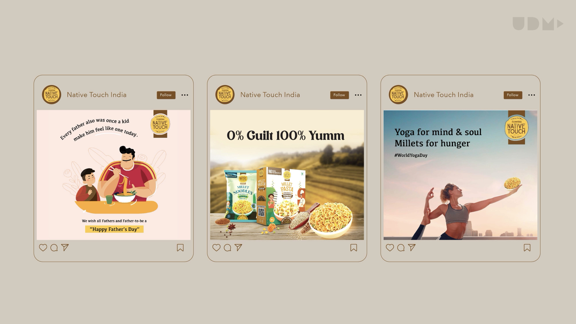
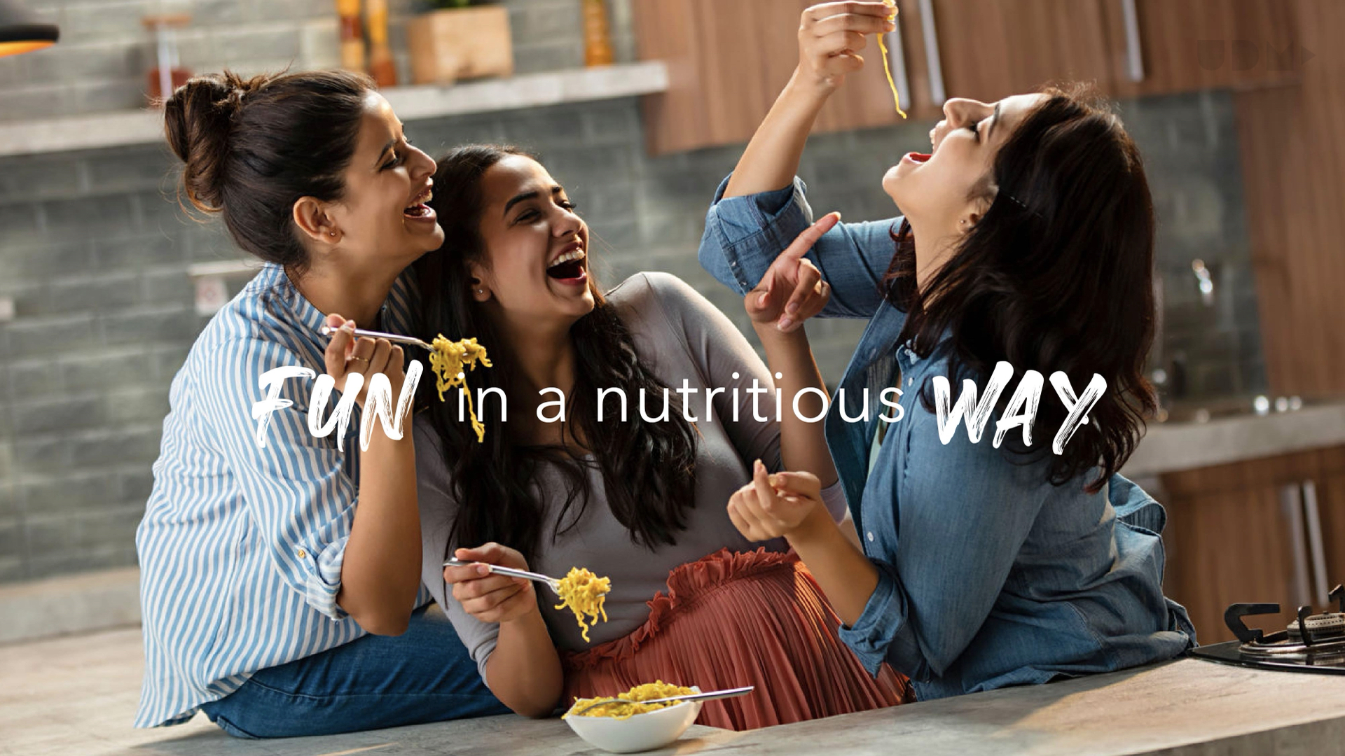
The client tasked us with creating a new brand for a “ready to cook” and “ready to eat” product line. The challenge was to develop a brand identity and design language that highlighted “Native” ingredients and was “fun” to eat, while still staying competitive with established players on both quality and price. Our goal was to resonate with consumers without being preachy.
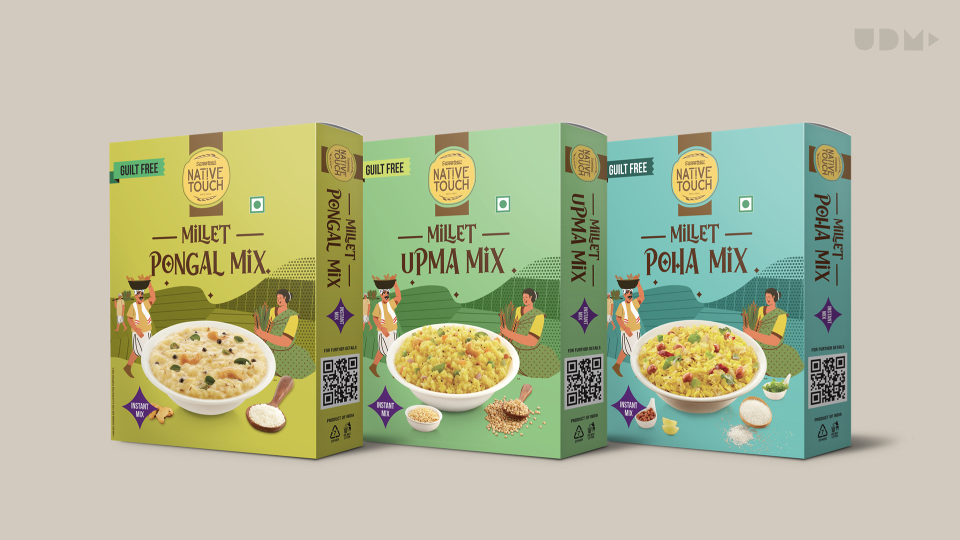
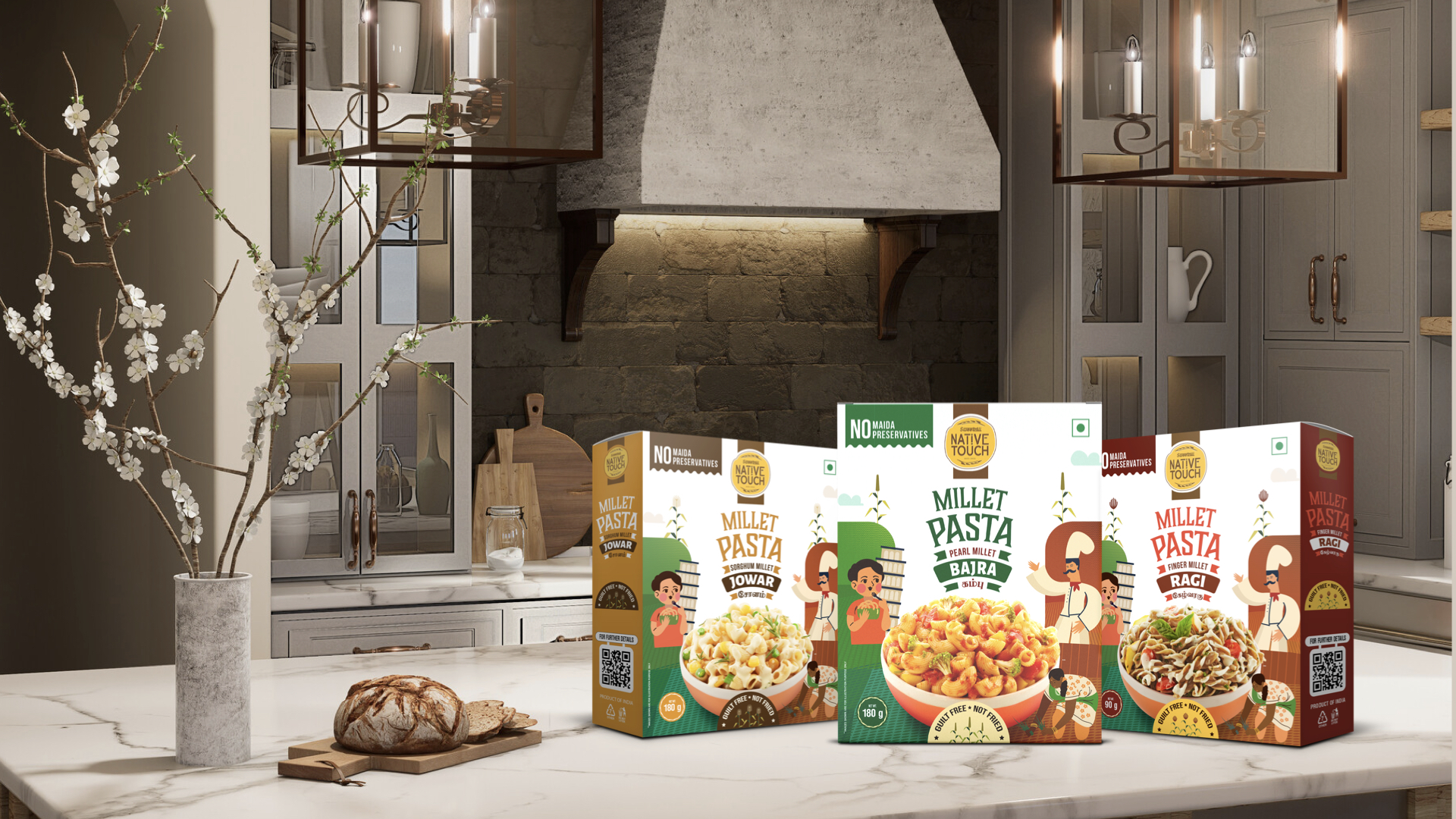
Authentic Appeal. Higher Consumer Interest.
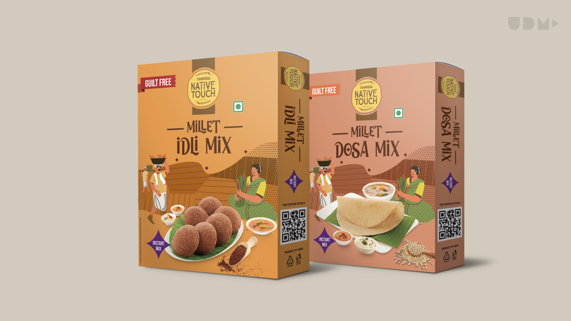
Building on the hand-drawn style, the design uses vibrant, colorful ingredient illustrations to tell a cohesive “Native Touch” story across products. This aesthetic is supported by a mix of modern and native typography. Key benefits are highlighted with clear icons, creating a fresh, authentic, and trustworthy brand. The packaging blends tradition with a playful, modern feel to capture consumer attention.